Hitachi Digital Branding.

What we do
Digital Identity
Brand System
Brand Experience
Motion & Behaviour
Design System
Digital Guidelines
Brand Center
Overview
We joined Hitachi’s international rebranding project while its new corporate identity was still being developed. With the strategy and much of its foundation already in place, our role was to develop the brand’s digital expression and design its key digital experiences.
We needed to build an ecosystem that would support the company’s digital transformation, a central part of its business strategy. This meant creating a digital system that would establish recognition of the new identity while giving marketing departments, agencies and local teams across more than 40 countries the guidance and resources to apply it and continue developing it consistently.
The scale of the project meant thinking beyond the initial applications. The new identity needed to retain its character across websites, apps, newsletters and social media, while remaining useful, easy to understand, practical to apply and consistent for the teams creating new experiences in different contexts.

Designing the key experiences allowed us to test the brand assets in real contexts, explore their potential and refine some decisions within the wider corporate identity. The relationship between brand and experience became a two-way process: the brand foundations guided the design, while the different applications helped enrich the system as a whole.
We approached digital expression as a connected system. Messaging, tone of voice, imagery and composition all needed to reflect the same intent, as did the movement and behaviour of individual elements. This allowed us to translate strategy into practical decisions about how content is presented, how hierarchy is established and how users interact with the brand, making interaction itself part of its expression.
We reviewed the grids, typography system, logo, its relationship with the tagline, key visuals, icons and other graphic assets. We adapted them into a fluid system that could accommodate different needs, formats and content, and expanded the colour palette to enrich the brand’s expression and meet its digital requirements.
The system also needed to provide a flexible foundation for other brands within the company. We defined shared assets and guidelines that could be adapted while respecting each brand’s identity and specific communication needs.
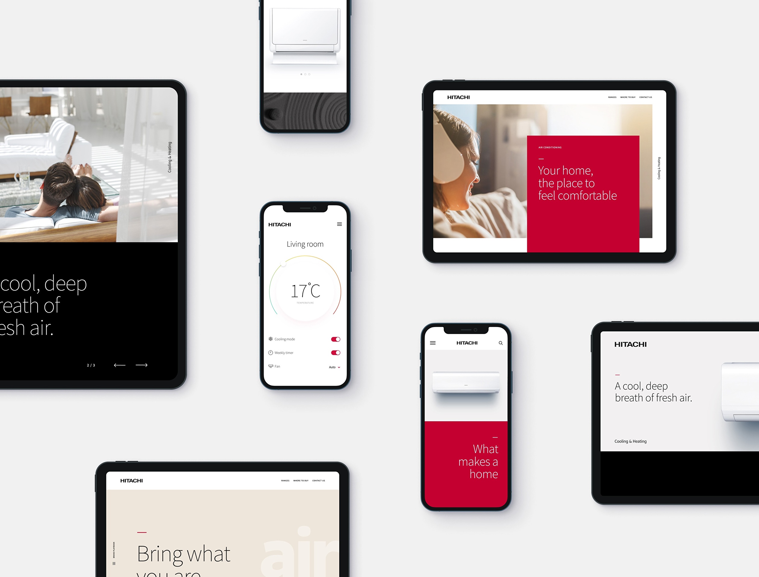
For Hitachi, we defined a motion language rooted in the brand strategy and identity, translating its personality into how it behaves over time. This was essential to giving the brand the flexibility and scalability needed to support its transformation.
The animation guidelines helped preserve that character across different digital experiences, making motion a distinctive and recognisable part of the brand.


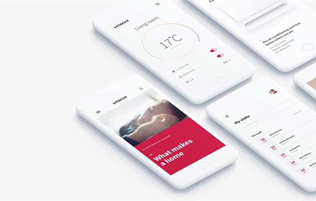
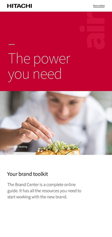
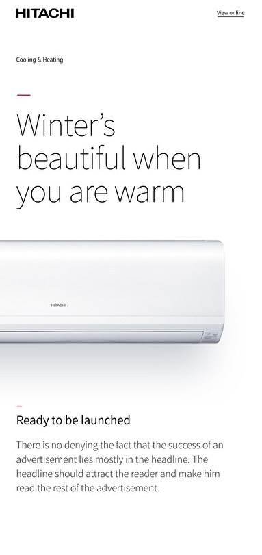

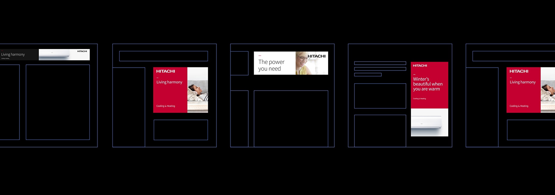
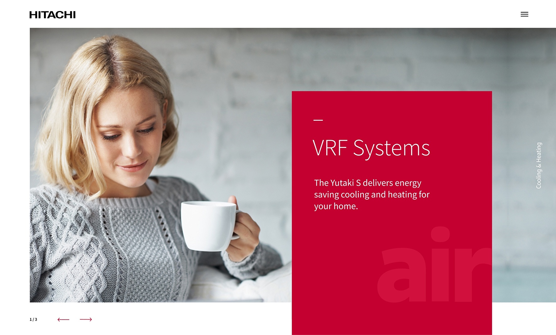
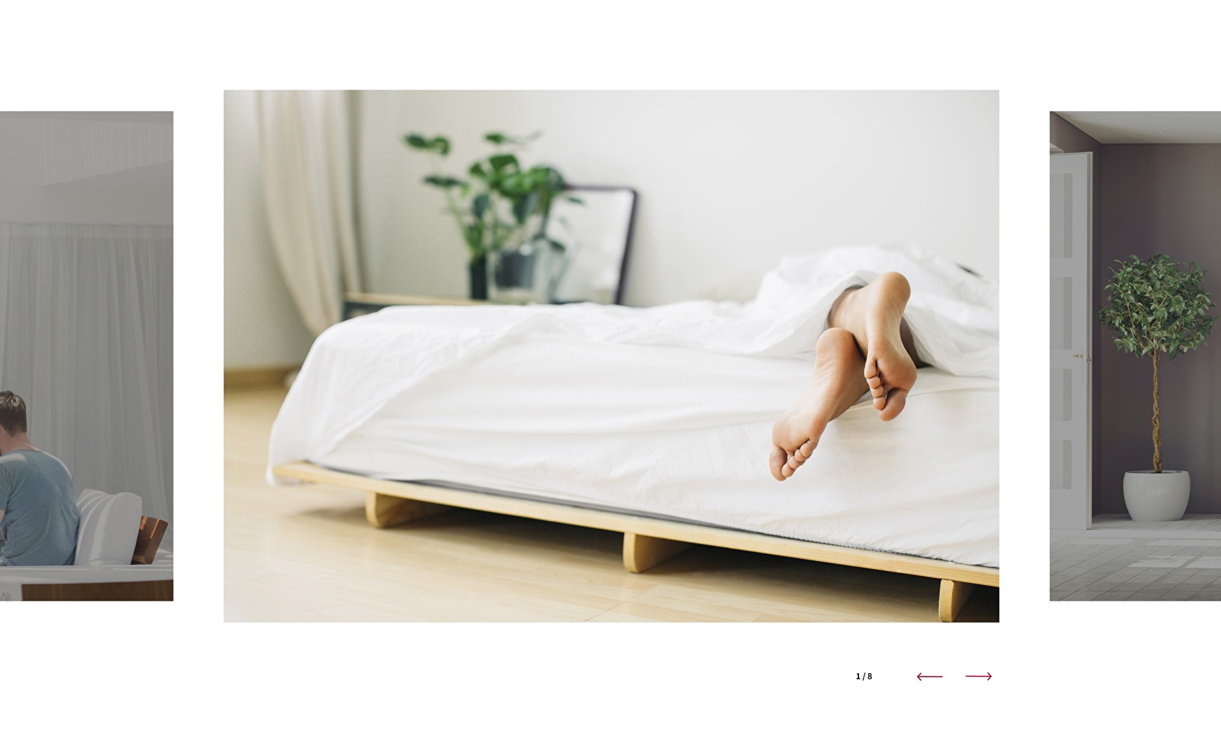
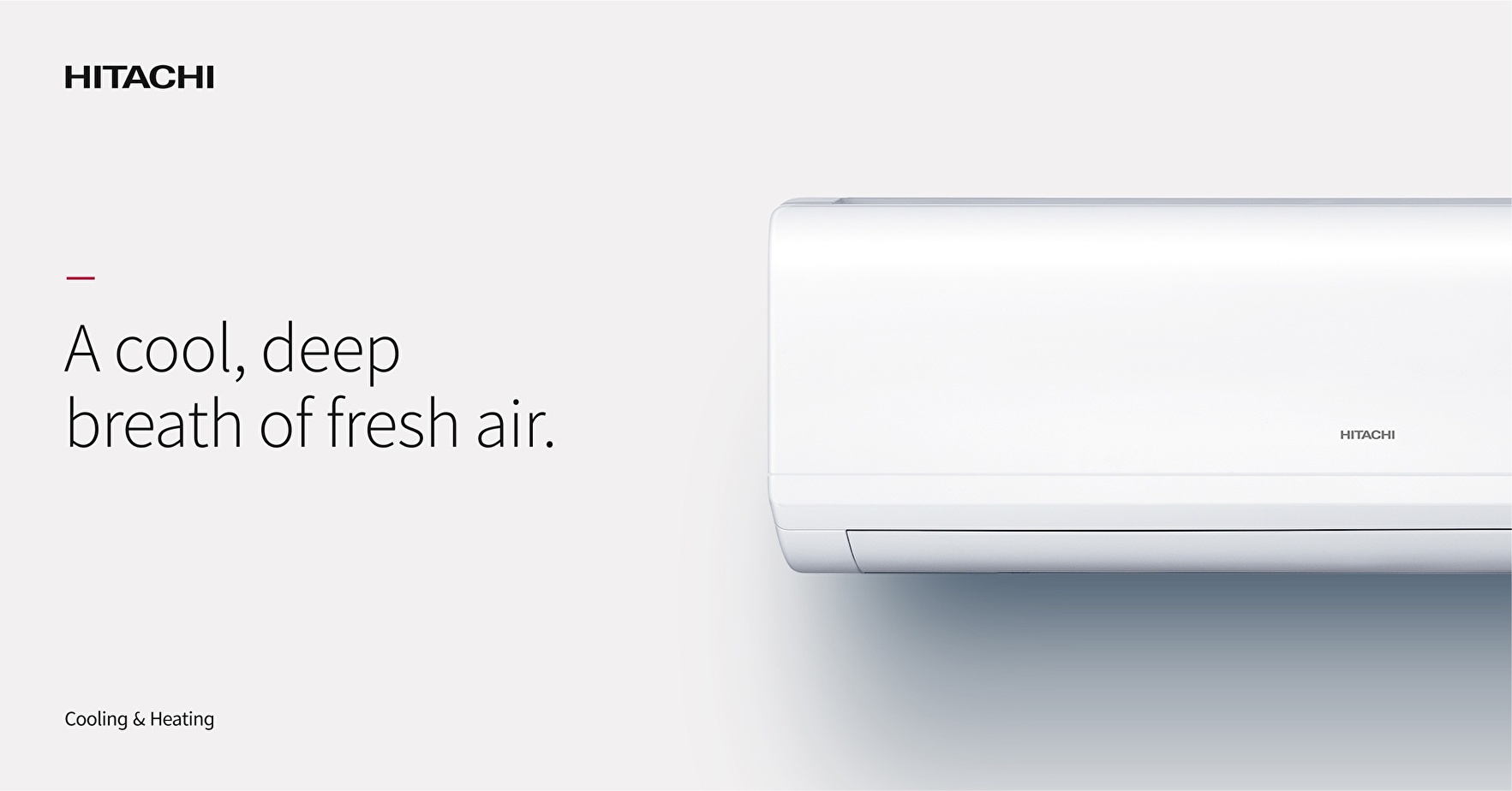


To bridge the gap between design and implementation, we created a digital Design System bringing together the thinking behind the decisions, design principles, animations, reusable components and templates.
A dedicated web guide connected design with implementation, providing guidance on frontend development, animation and motion, content and tone of voice. This gave local teams and their agencies a shared foundation from which to expand their websites and create new digital experiences.
The platform formed part of an internal rebranding activation campaign involving the entire company, structured around three stages: announcing the change, introducing the new identity and enabling its implementation.
The final stage gave teams access to the Brand Center, the websites already built and the Design System platform, all ready to accommodate content from each market. Teams also received the website strategy, implementation guides, CMS instructions and a recorded webinar explaining how to create and manage content.
This activation prepared teams to work with the new brand and develop its digital presence alongside their local partners.
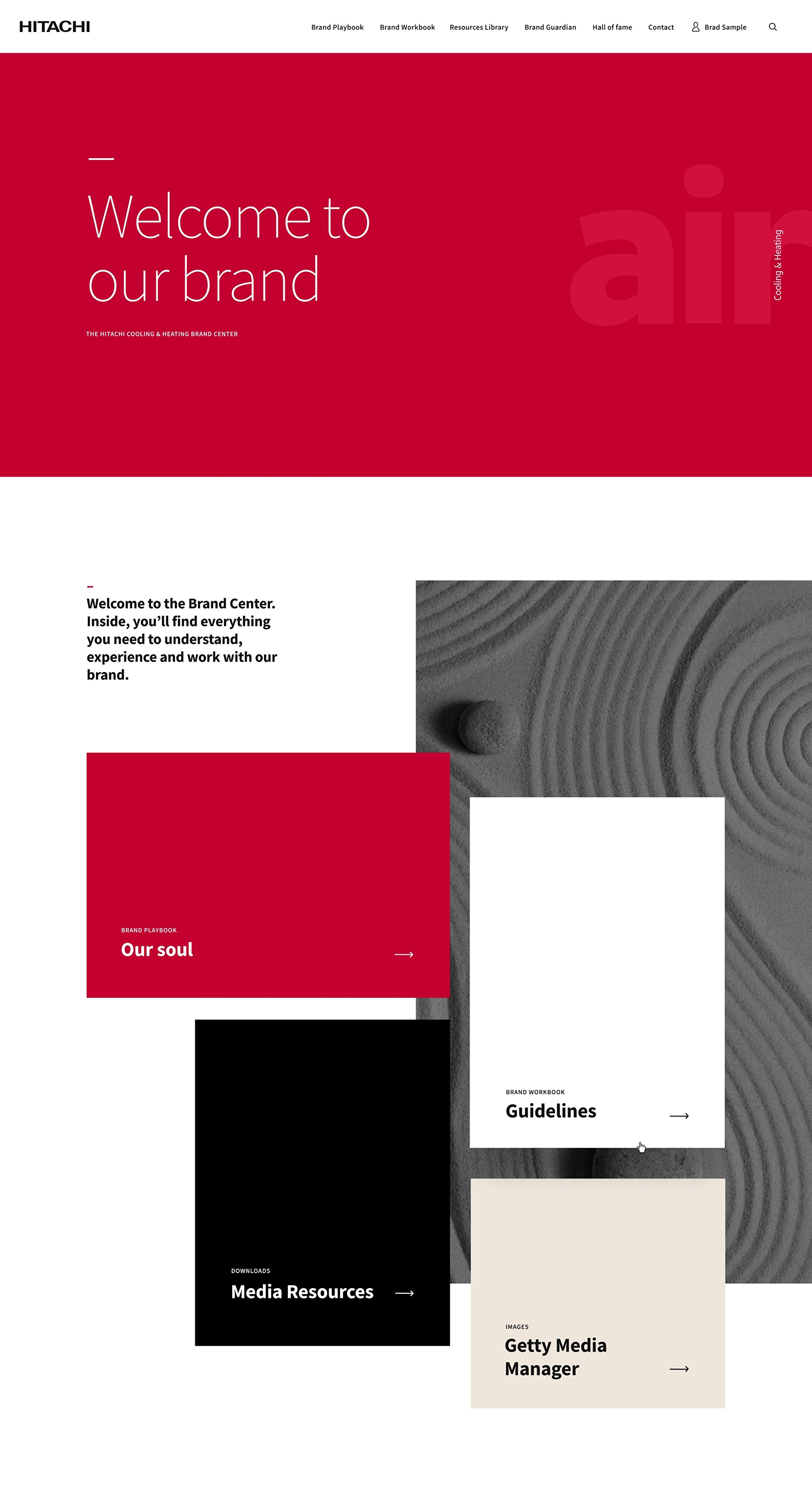
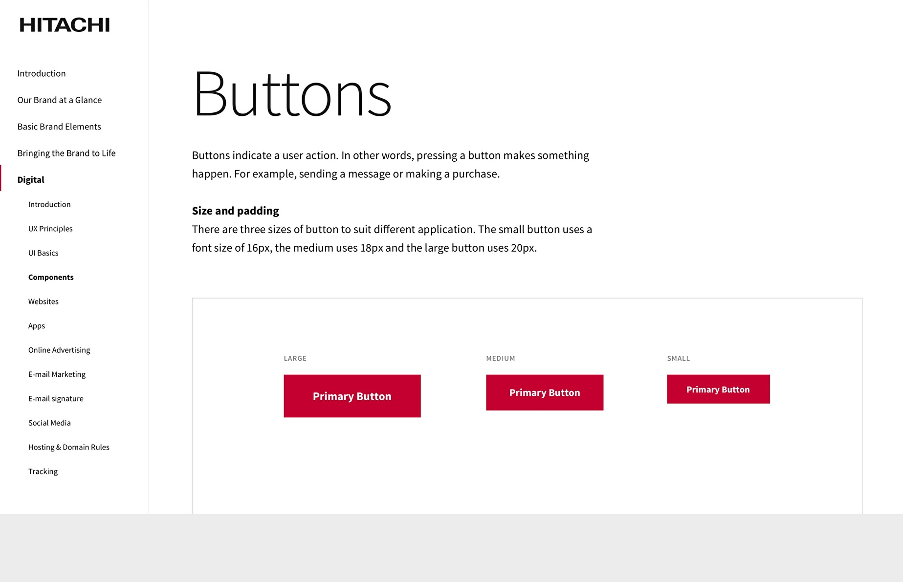
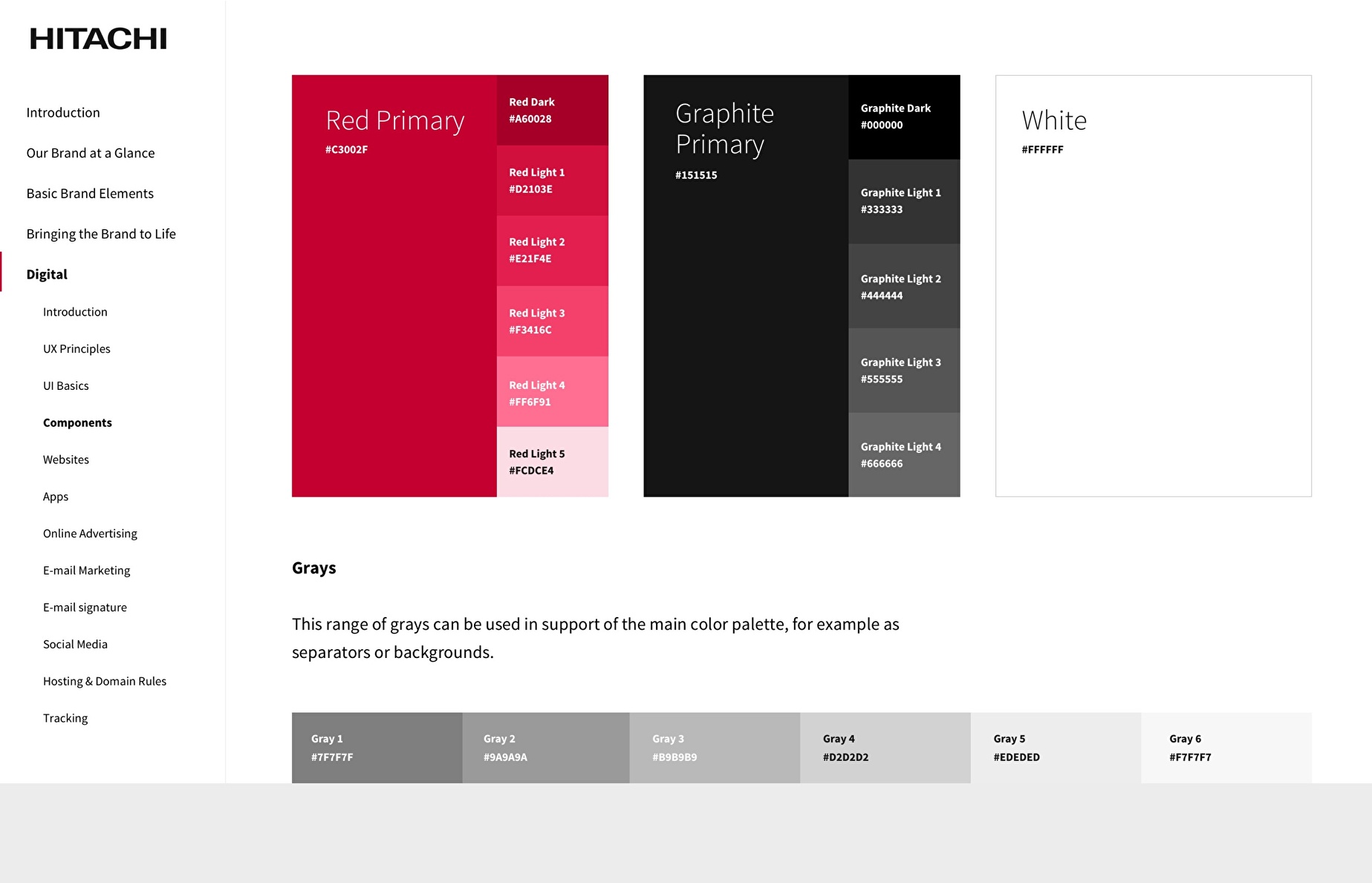

The guidelines, interactive Design System and Brand Center provided a common reference for departments, agencies and local teams.
Building on this foundation, we designed websites and other digital products for the company, while equipping teams with the tools to continue developing their brand presence with coherence and consistency.
This work also shows that the continuity of a global brand depends on how it is shared.
When multiple teams and markets are involved, guidelines and tools become an integral part of the design process. Connecting brand strategy with a digital language and a system that enables teams to keep creating new, coherent expressions is essential to building lasting value for the brand.