IOTA Foundation.
©2018
Branding and corporate website redesign.
What we do
Strategy
UX research
UX/UI design
Tone of voice
UX research
UX/UI design
Tone of voice
Overview
IOTA is a blockless distributed ledger which overcomes the limitations of blockchain technology… I know, right? That’s why we were asked to design a concept website for potential users and investors, to help them understand the proposition and differentiate IOTA from its competitors in the emerging blockchain and cryptocurrency world.
Discovery process.
So, IOTA is a blockless distributed ledger which uses something called the Tangle to deliver microtransactions for the Internet of Things. Okay? Not okay. Our first job was to untangle the Tangle. To do that, we invited (with our client’s permission) some big-brained data, security and technology specialists to help us gain a deep understanding of the technology behind IOTA.
Finding the human story.
As well as giving us a deeper technical understanding, the discovery process revealed the human story of IOTA. While the technology is critical, we felt the philosophy behind the project and the people that drive it make it relatable to users and investors. By telling this story through our design and messaging, we would make IOTA tangible and differentiate it from competitors.

Information architecture.
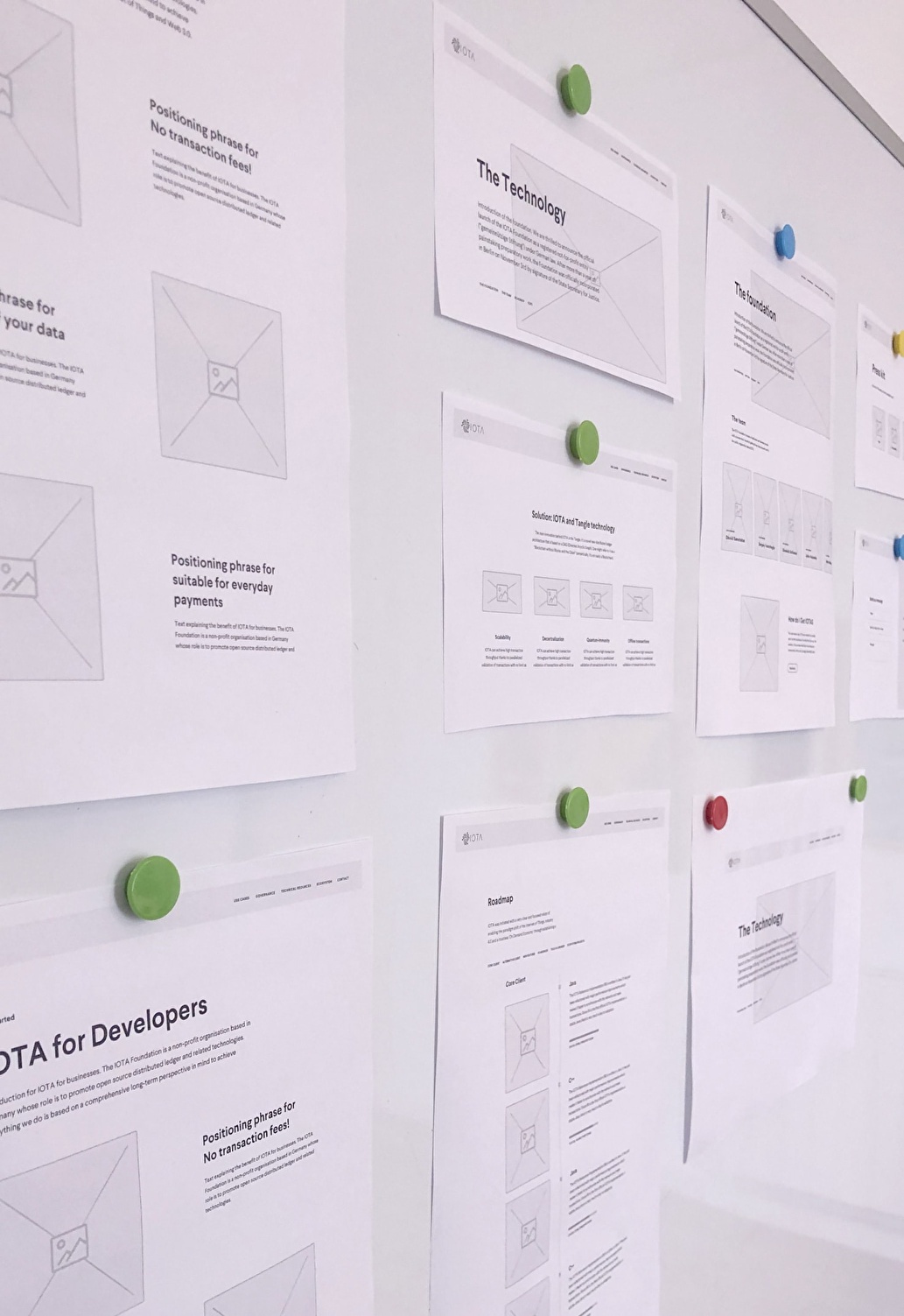
To tell the IOTA story, we had to hook interested but non-technical users. We wanted to give them a soft landing and not overwhelm them with detail. Then let them easily explore the topics that interest them. To achieve this we developed a relatively flat architecture that gives a high-level overview of the idea, technology and real-world challenges it solves, as well as the people behind it.
Visual design.
The design reflects the openness and optimism of the IOTA project. The spacious and lightweight feel help avoid the information overload that competitor sites often suffer from. The colour also helps differentiate it. We chose purple for its calm, positive connotations, and also its boldness. A clean, purposeful line-graphic style and smooth animations reflect the elegance of IOTA technology. In line with the overall concept, any graphics, animations or photography should be part of the narrative and never just space fillers.
Real world use cases.
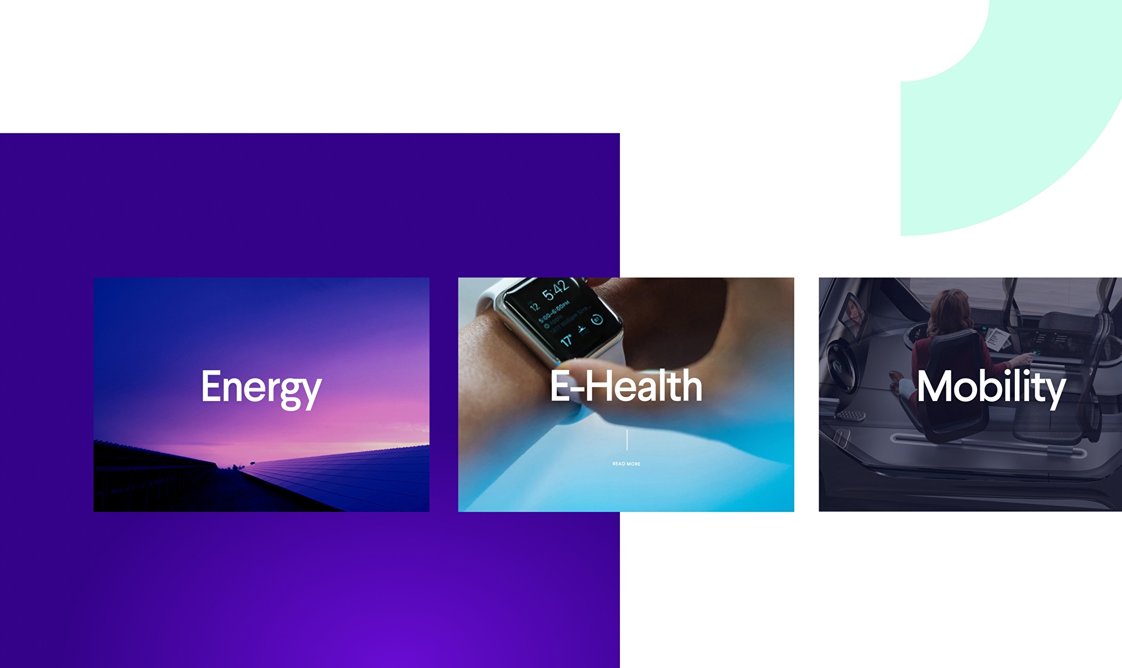
One of the striking thing about IOTA was that it was known more as a cryptocurrency and less as a revolutionary technology. IOTA, or something like it, will inevitably be part of the fabric of modern life. By adding real-world use cases, we would bring the technology to life in ways that appeal to specific users.

Real people.
IOTA has an impressive and interesting team behind it. As an open-source technology and not-for-profit organisation, it seems natural to showcase those people. Also, for something that could seem relentlessly technical, it helps gives it a lovely human face.


